Don Charliee
As an avid Twitch streamer with an energetic personality, Don Charlie guarantees a fun time on his gaming channel. However, balancing world-saving with the challenge of standing out in a sea of streamers is no easy task. To differentiate himself, Don needed a strong brand presence that showcased his rockin’ fun content.
UPBEAT
ENTERTAINER
ENERGETIC
industry
services provided


THE PROBLEM
The struggle to be seen among Twitch streamers
With numerous streamers on Twitch, Don Charlie risks blending in with the crowd without a unique identity. His vibrant personality is one of his greatest assets, but in a space saturated with content, he needs something more than energy alone to stand out. Without a distinct branding approach, his streams might never reach their full potential, leaving him competing for attention among countless others.


THE PROBLEM
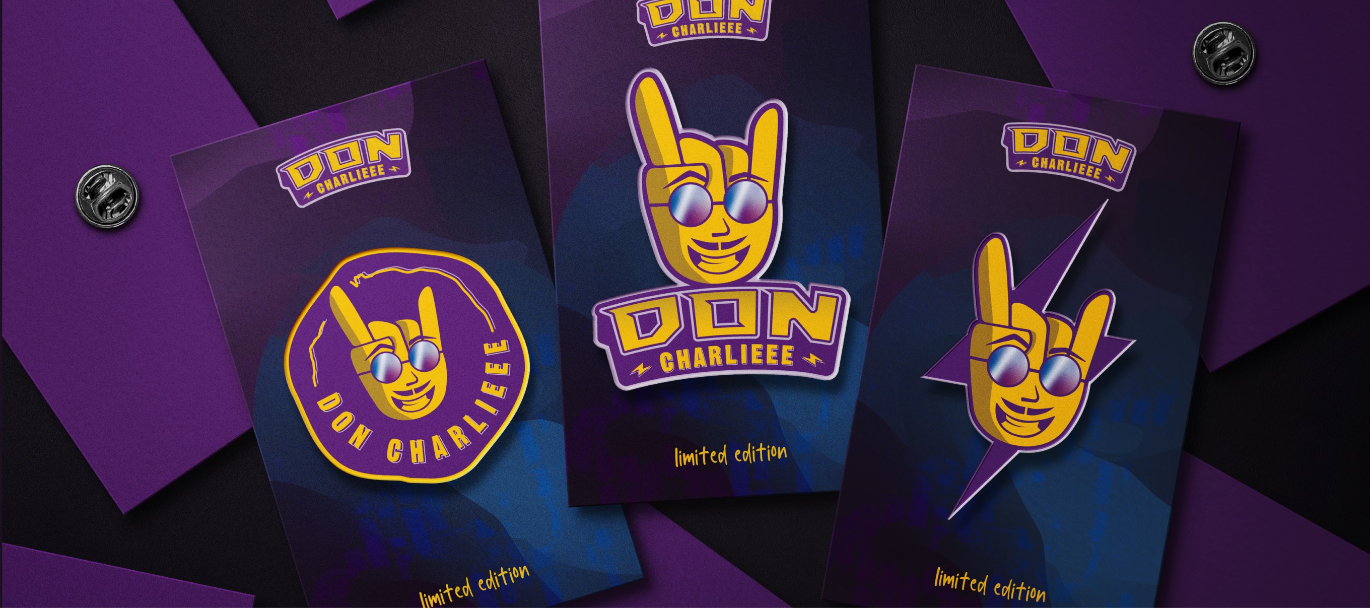
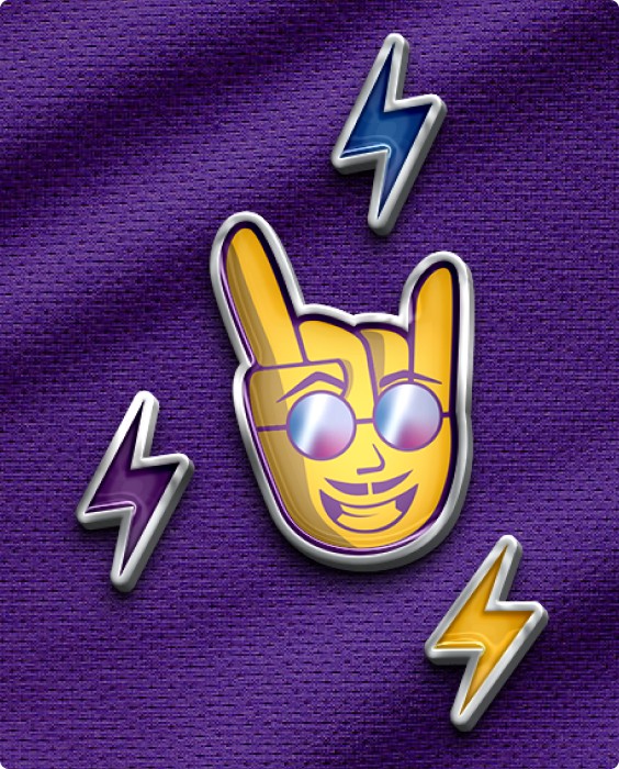
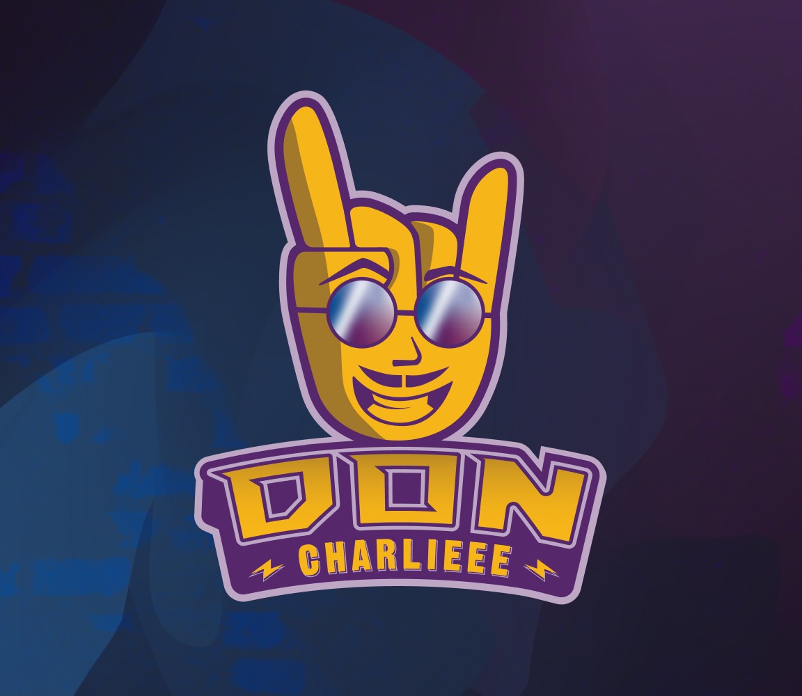
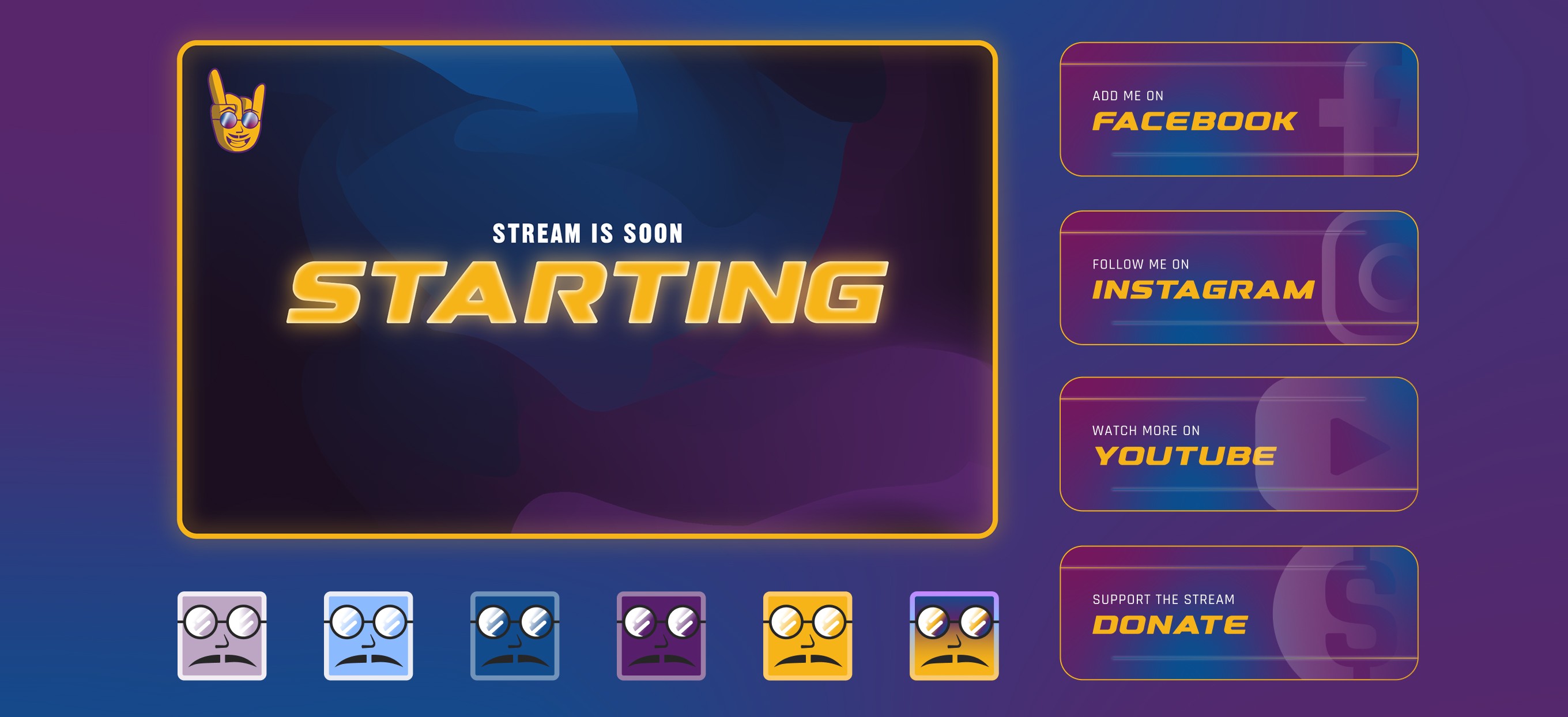
The power of fun: How Don Charlie's brand reflects his energetic vibe
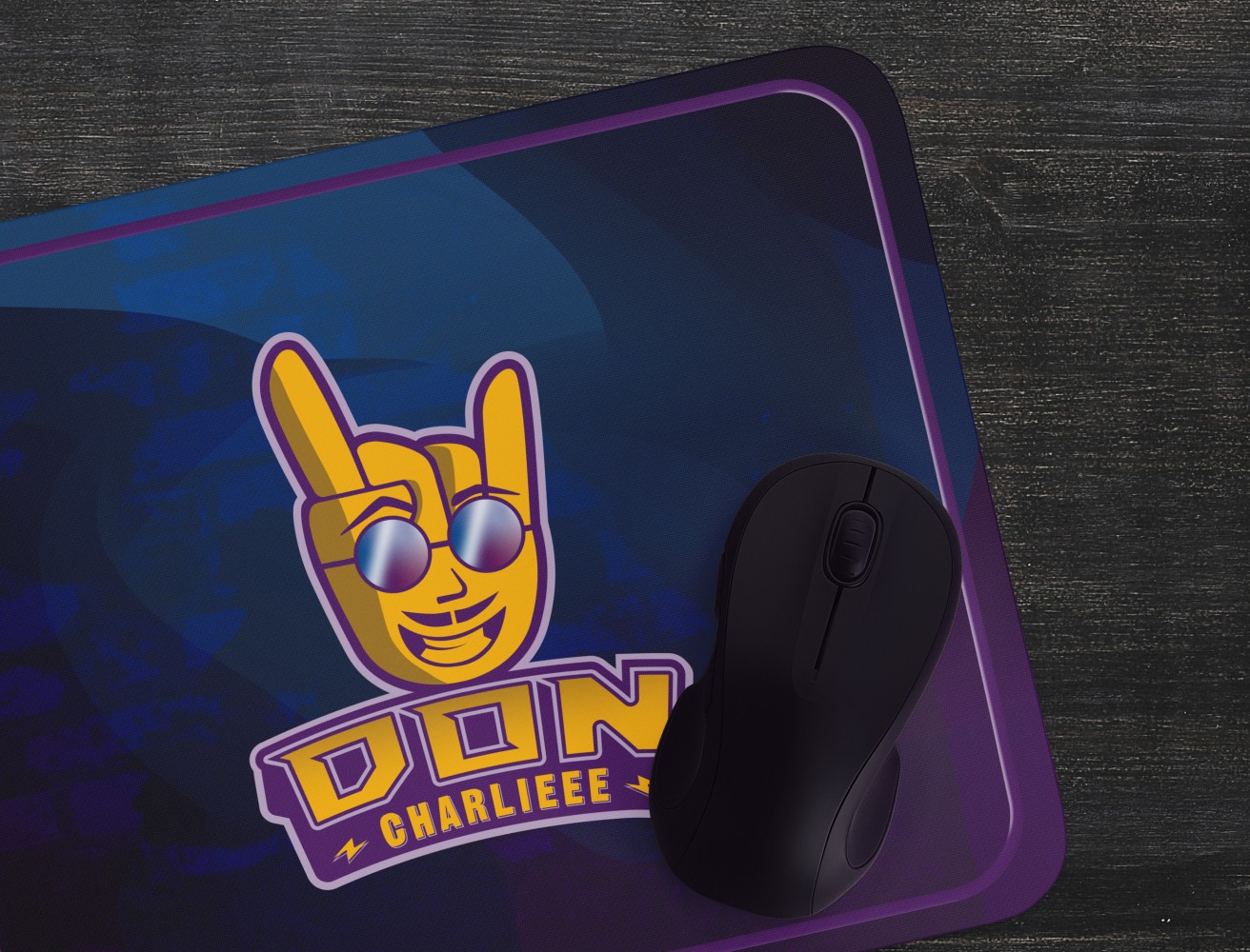
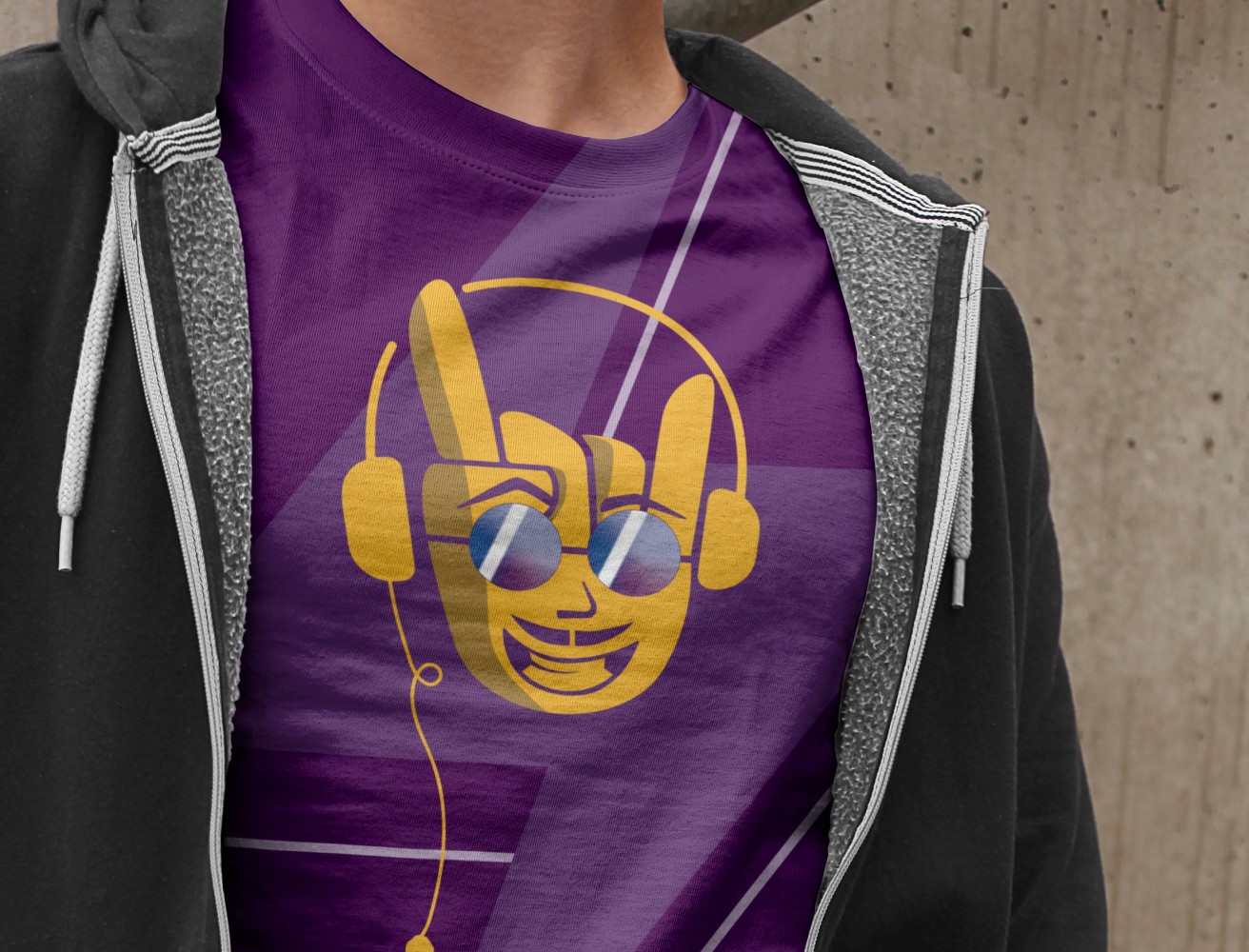
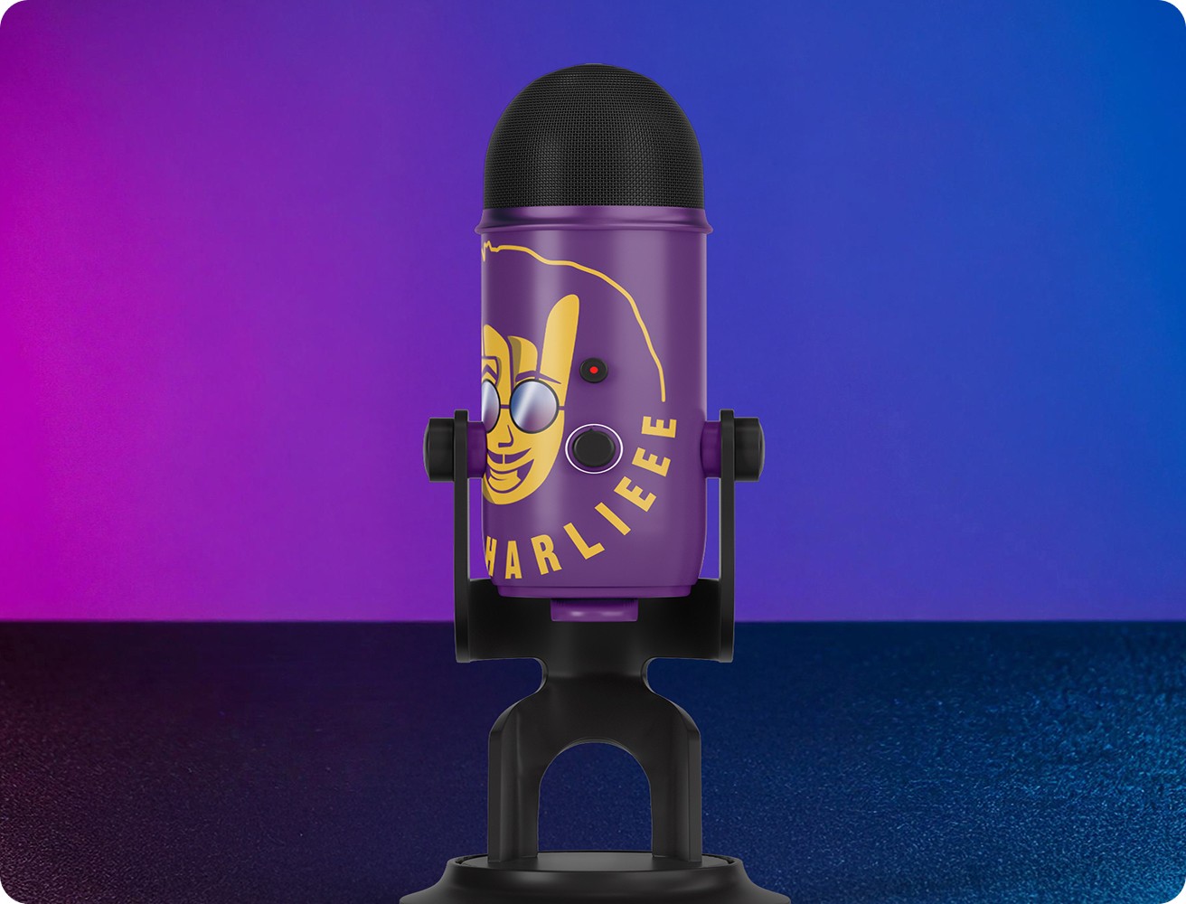
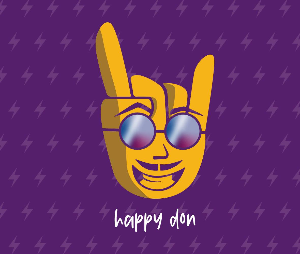
The rockin' hand symbol captures Don Charlie’s energetic and playful personality, becoming the perfect visual representation of his engaging approach to streaming. It not only adds a fun and approachable touch to his branding but also aligns with his passion for entertaining his audience. The bright purple and yellow colors further amplify the lively, positive vibe of his channel, making it instantly recognizable and creating a strong connection with his viewers who seek a dynamic and uplifting experience.

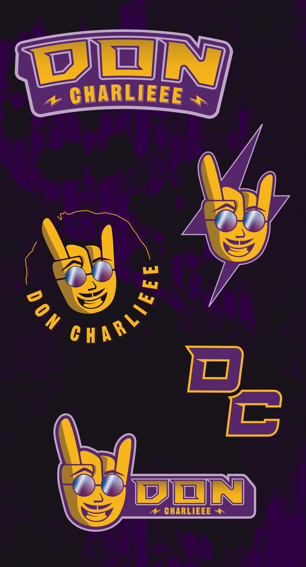


The power of consistency
Every element of Don Charlieee’s brand, from the vibrant color palette to the rockin' hand symbol, is carefully crafted to reflect his fun, engaging style. These cohesive branding choices ensure his channel stands out and connects with viewers looking for a lively, entertaining experience.

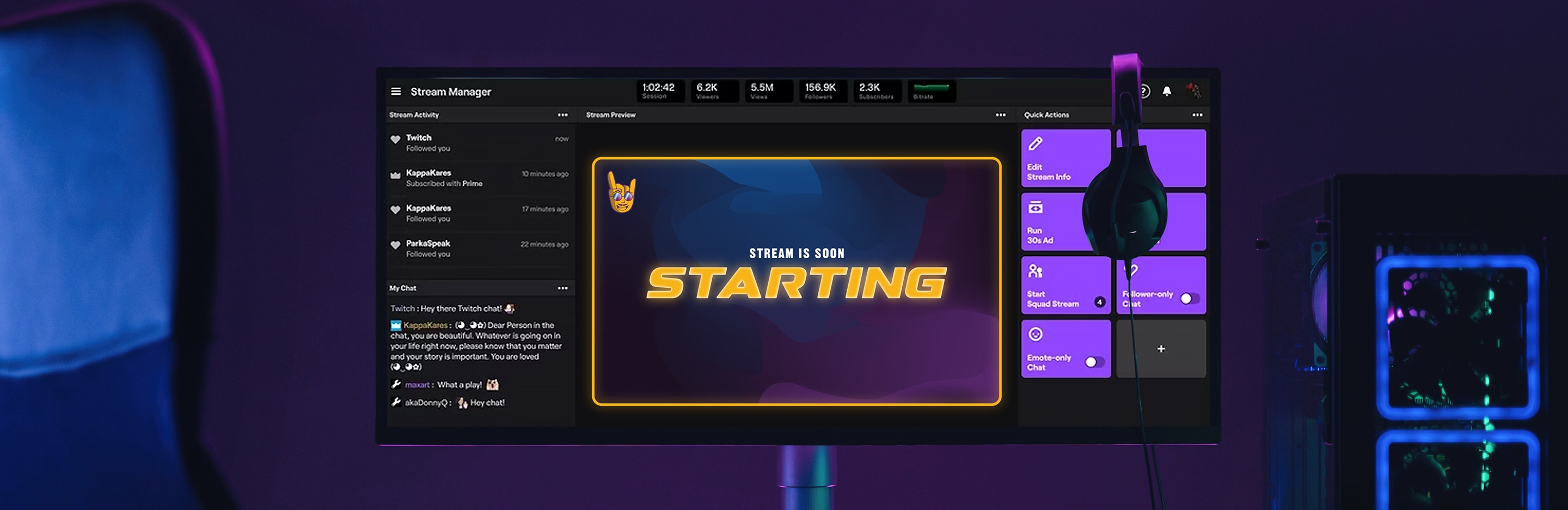
The mesh gradient of purple and blue adds a touch of fluidity and depth to the design, aligning perfectly with this fun, engaging streaming style.
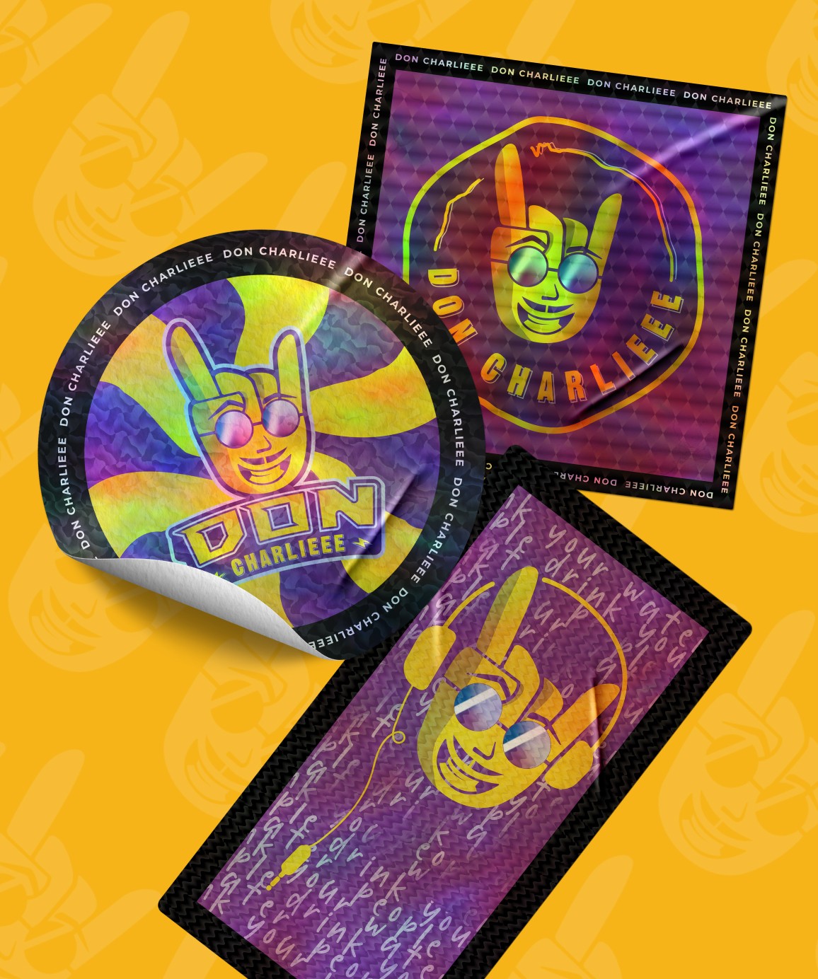
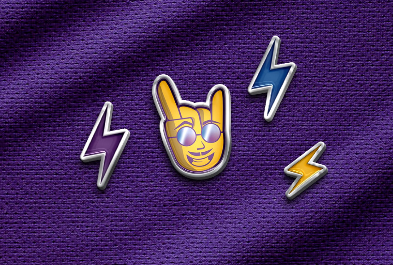
With a range of expressive poses, the mascot captures the fun and lively spirit of Don Charlieee’s channel, keeping the brand dynamic and relatable.
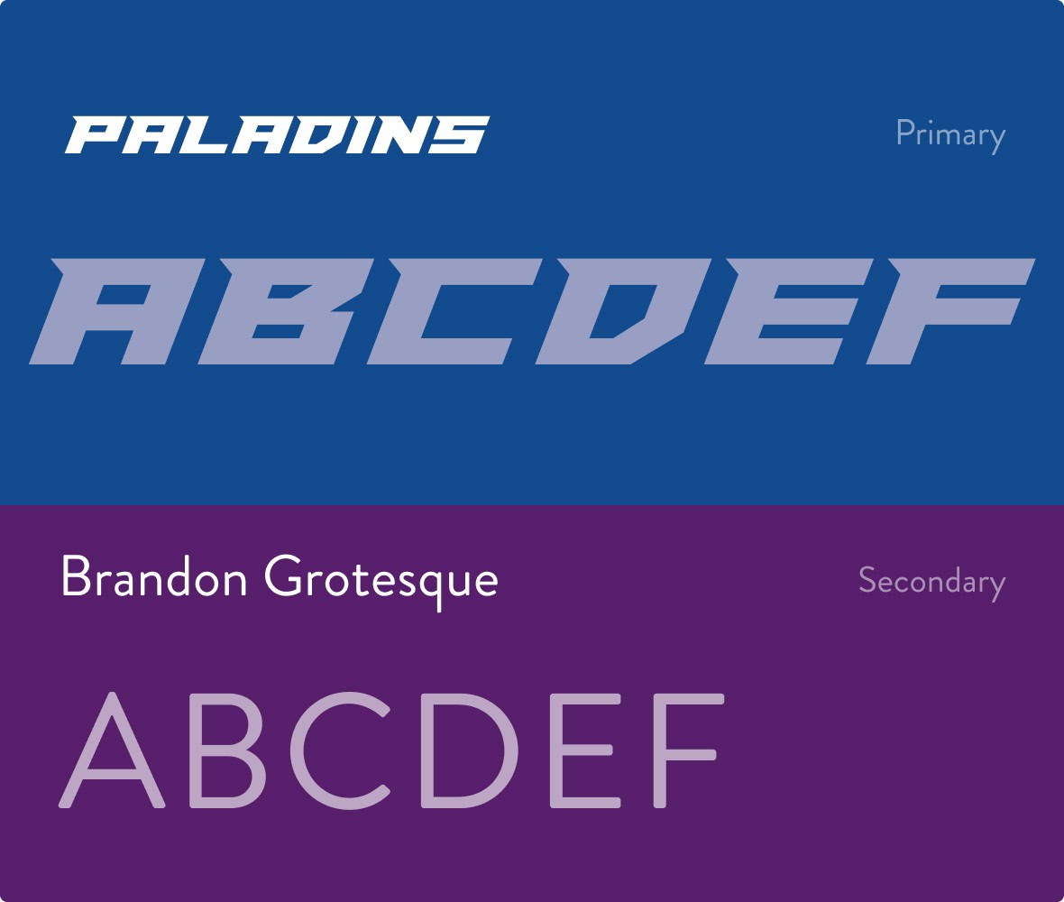
The bold and clean font pairing captures the essence of the brand’s lively and approachable style.
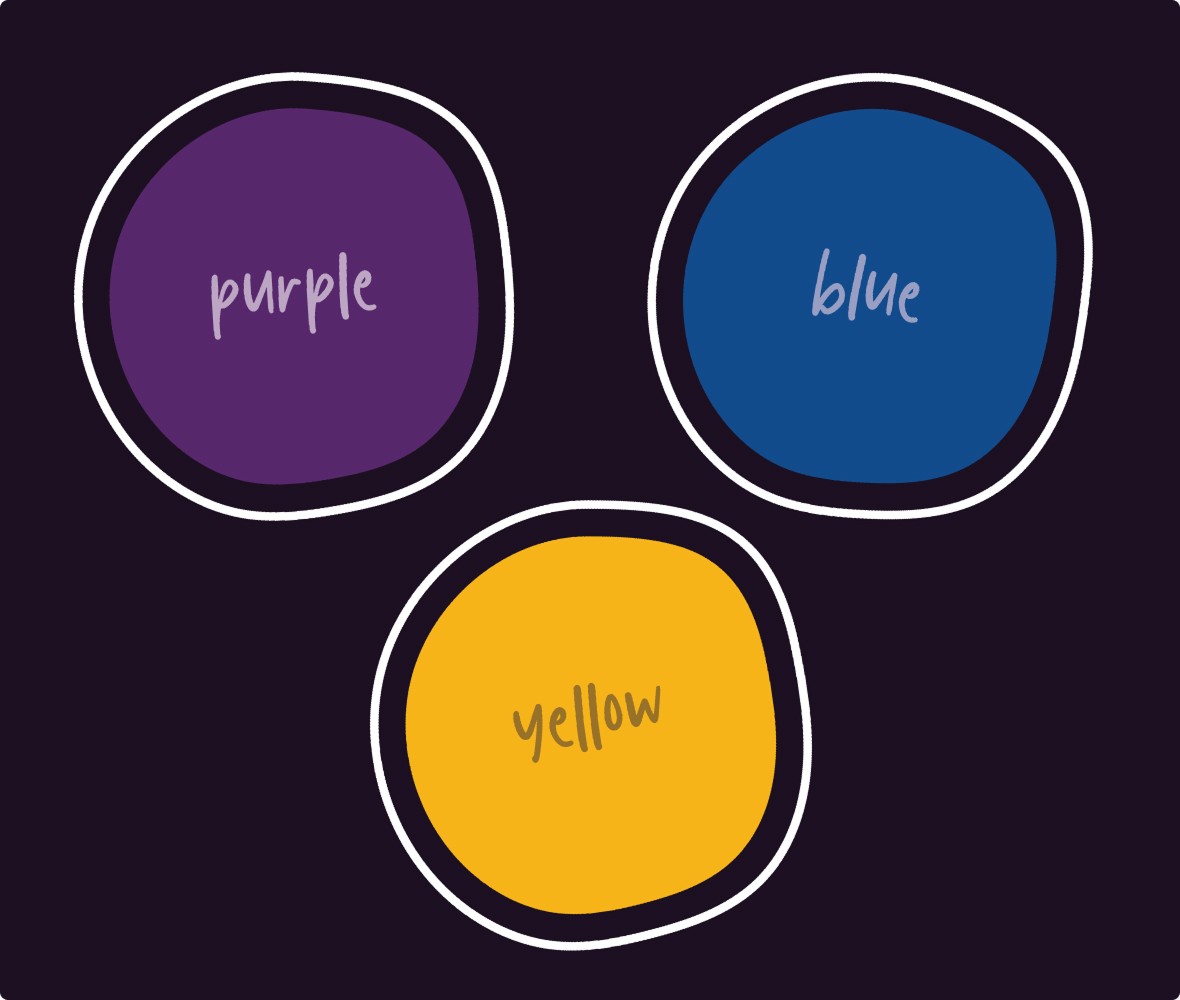
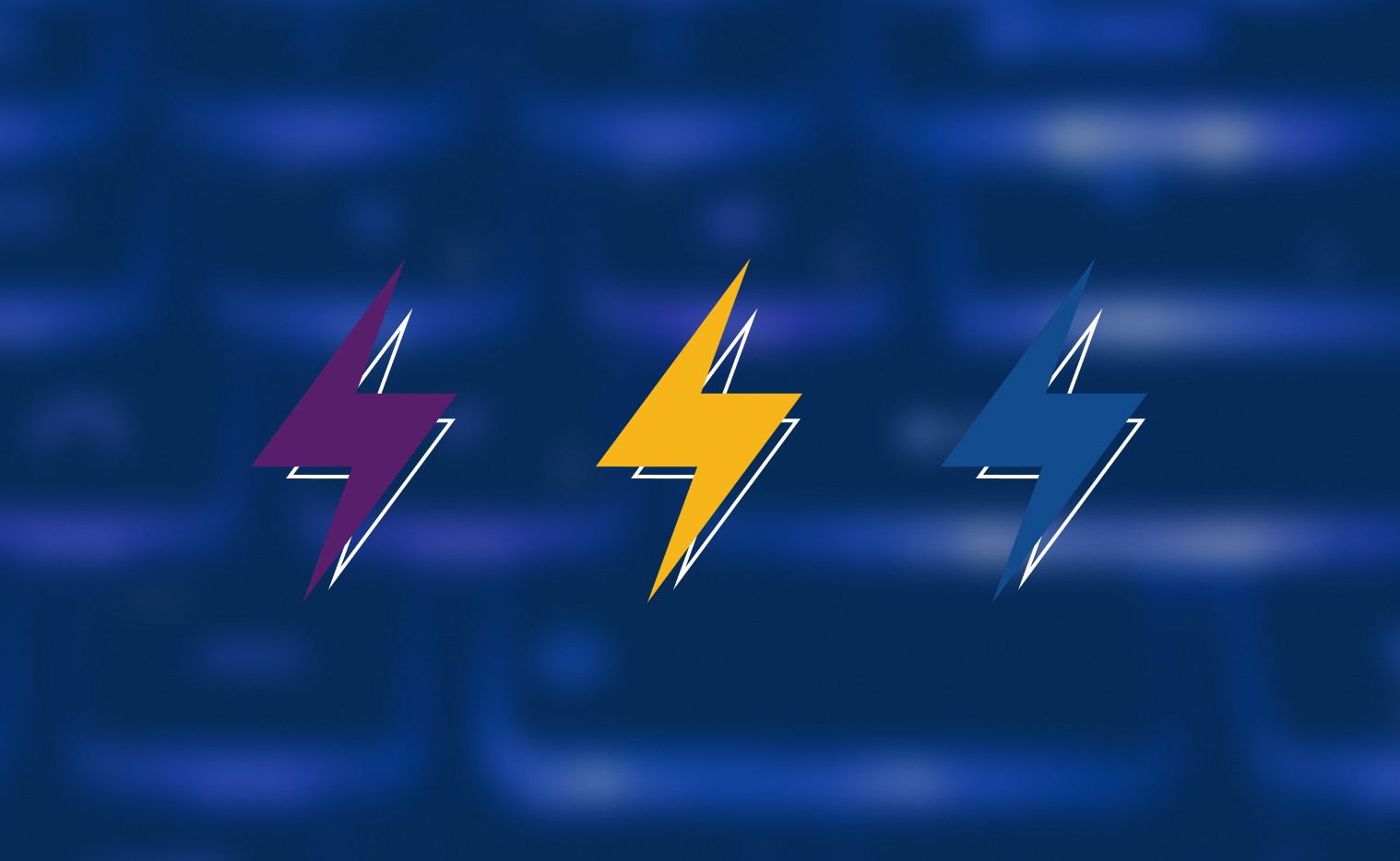
The eye-catching color palette injects fun and energy into the brand, aligning with high-energy content.